
Every year brings a fresh crop of predictions about what our homes are supposed to look like, and most of them are forgotten by March. A few actually stick though, and this year it is not just about colour. Finishes have changed, kitchens are being treated differently, and there is a growing preference for work that lasts rather than looks good for a season. Matthew Wade Decorators is based in Stamford and works across the surrounding counties, so here is what people are asking for at the moment.

Grey has finally stepped aside
Warmer neutrals have taken over. Clay, oatmeal, putty, stone, the sort of colours that have a bit of red or yellow buried in the undertone rather than blue. The difference matters more than it sounds, because cool greys can look flat and slightly miserable under British light, especially in a north facing room in February.
Warm neutrals also happen to be brilliant in a family home. Fingerprints at toddler height, the scuff where the scooter lives, that mark on the landing wall nobody will own up to, all far less obvious than they would be on brilliant white.
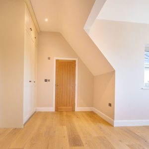
Green, but warmer than the sage everyone had
Olive and moss have replaced the cooler sages of the last few years. They are lovely in kitchens and dining rooms, particularly against wood, and they make plants and natural textures look good rather than fighting them.
Colour drenching
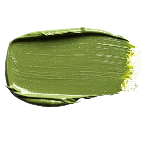
Colour drenching means one shade taken everywhere. Walls, ceiling, woodwork, skirting, the lot. Written down it sounds like a lot of paint, and it is, but the effect in a snug or a small hallway is genuinely cosy rather than overwhelming. Old houses with awkward angles and odd little recesses suit it especially well, because drenching stops the eye tripping over every change of surface.
Preparation is where these jobs are won or lost. Every edge has to be right when there is no contrasting woodwork to hide behind.
Colour capping
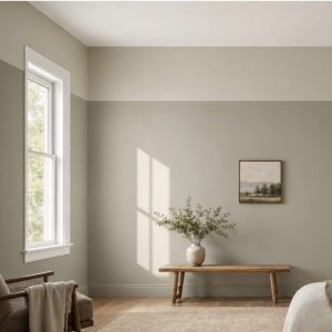
Colour capping is the one people ask us to explain. It means bringing a colour down from the ceiling onto the top section of the walls, stopping at picture rail height or somewhere sensible, so the room looks as though it is wearing a cap. Rooms with high ceilings benefit most, because it pulls the eye down and makes a large space feel less like a village hall. Dark caps over a pale wall look striking in a dining room or a bedroom, and a softer version with two close tones works well if you want the effect without the drama. Getting the line right is the whole job, since a wobble of a few millimetres is obvious from the doorway, so it is worth doing properly rather than freehand.
Deep reds and jewel tones
Burgundy, plum and dark cherry have had a real surge. They work best in rooms used in the evening, so sitting rooms and dining rooms mostly, and they look properly rich alongside wooden floors and brass. Most people keep bedrooms lighter and save the drama for downstairs.
Matt walls, eggshell woodwork
Gloss has more or less disappeared from interiors. Soft matt on walls and eggshell on doors and skirting is the standard request now, and modern matt is far tougher than it used to be, which makes it a realistic choice for a busy house rather than something you have to tiptoe around.
Kitchen respraying instead of a new kitchen
Cabinet respraying is one of our busiest jobs and the sums are hard to argue with. Solid carcasses, tired doors, a colour that dated five years ago, and no real reason to tear the whole thing out. Navy, olive and warm clay are the shades people keep landing on, usually with something lighter on the walls to stop it feeling heavy. No skip on the drive and the kitchen back in use in days rather than weeks.
Spray plastering
Spray plastering gives an ultra smooth white finish on walls and ceilings and it is considerably quicker than traditional plastering. Older properties round here are full of character and rarely full of straight lines, so it is a useful way of starting from a clean surface before any decorating happens.
Outside, colours are getting warmer too
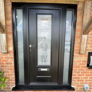
Exterior shades have moved away from stark white towards tones borrowed from stone, clay and foliage. Front doors are having a moment. Deep greens, soft blacks and proper reds are everywhere at the moment, and a repainted door with tidy frames changes how a house looks from the road far more than the cost suggests it should.
A word about actually living in the house
Trends are a nice starting point, though the more useful conversation is usually about how a room gets used. Whether the walls need wiping down every other day. Whether the paint has to be dry before the children come home. Low odour and low VOC paints have improved enormously, so rooms go back into service quickly, and we work around school runs and the general chaos of a household as best we can.
Thinking about getting something done?
Matthew Wade Decorators handles interior and exterior decorating, kitchen respraying and spray plastering for homes and commercial premises across Stamford and the wider area. Tell us which room is annoying you and we will tell you what we would do with it.
Call 01780 592513 or email matthew@matthewwadedecorators-co-uk.stackstaging.com for a no obligation quote.